You’ve heard about responsive web design, but what does it mean? And why does it matter? Responsive web design is the process of creating websites that can adapt to any screen size. This means that you can use one codebase to create a website for multiple screen sizes.
The benefits to this approach are obvious: users get a more natural browsing experience, and developers won’t have to create multiple versions of every page for different devices. That said, responsive web design isn’t without its own challenges—especially when optimizing content for smaller screens without sacrificing readability. Fortunately, there are some best practices you can follow that will help make your site more accessible than ever before.
1) Fluid grids
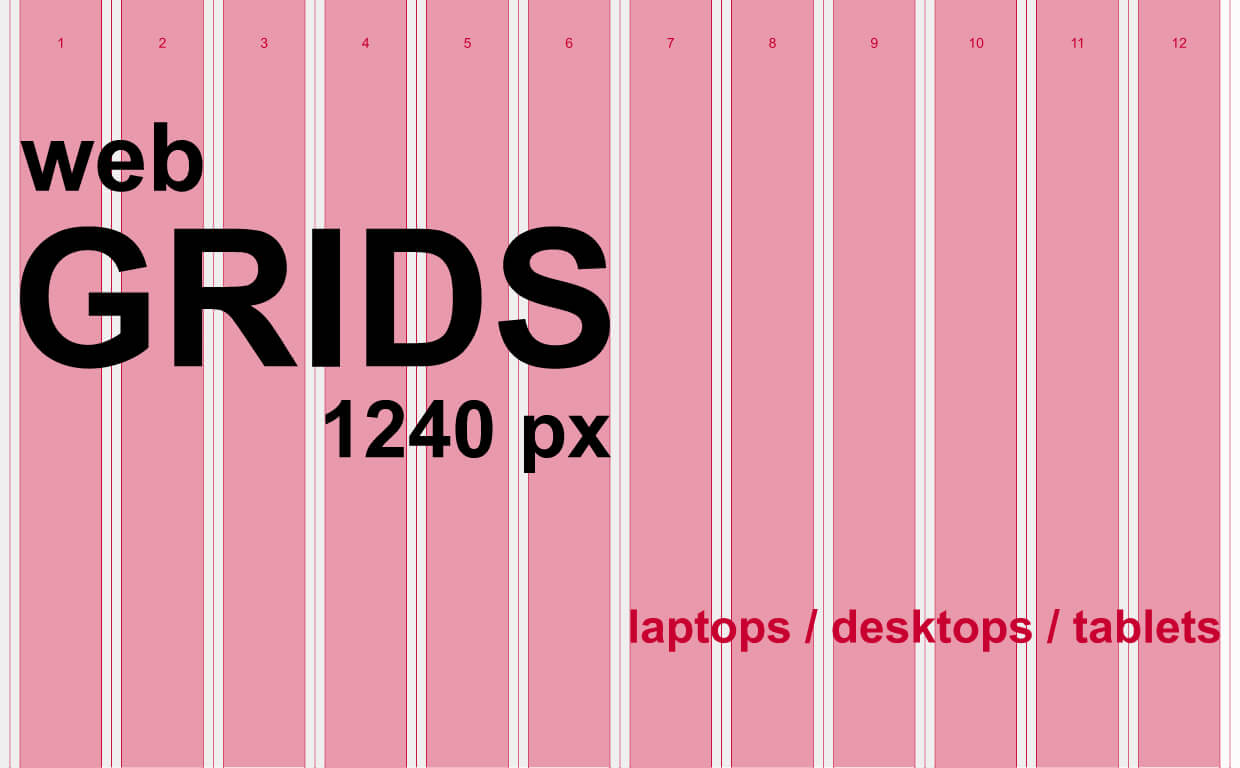
If your website doesn’t have a fluid grid, chances are it will break the design when viewed on smaller devices.
The reason for this is that desktop browsers like Chrome generally have a fixed width of 1024 pixels or greater. Mobile devices like iPhones and iPads on the other hand typically have a maximum width of 960 pixels. When an image is wider than 960 pixels on an iPhone 5 or similar device, it won’t reflow in order to fit the screen size. Instead it will spill out of the screen width unless restricted within a container.
Avoid this by using Flexbox or CSS Grid Layout with media queries set at different screen breakpoints. We could place our column elements inside a flexible container so they’ll adjust to the available space.
2) Responsive images

Images are typically restricted to a certain pixel dimension. This results in images being shrunk when viewed on small devices. Responsive images work by serving certain image files depending on the user’s device type.
There are a couple of ways you can implement responsive images. First is the use of srcset and sizes attributes.
<img
 srcset="elva-fairy-480w.jpg 480w, elva-fairy-800w.jpg 800w"
 sizes="(max-width: 600px) 480px, 800px"
 src="elva-fairy-800w.jpg"
 alt="Elva dressed as a fairy" />
The srcset attribute provides a list of image assets that the page can display. The sizes attribute defines the viewport dimensions at which it’ll display each asset.
The second way is by using the <picture>
<picture>
 <source media="(max-width: 799px)" srcset="elva-480w-close-portrait.jpg" />
 <source media="(min-width: 800px)" srcset="elva-800w.jpg" />
 <img src="elva-800w.jpg" alt="Chris standing up holding his daughter Elva" />
</picture>
It works similar to the first format. The source media specifies the viewport width that will serve the media indicated by the srcset. The src works as a fallback if the user’s browser does not support srcset.
The third way is resolution switching, by detecting a change in display resolution rather than viewport width.
<img
 srcset="elva-fairy-320w.jpg, elva-fairy-480w.jpg 1.5x, elva-fairy-640w.jpg 2x"
 src="elva-fairy-640w.jpg"
 alt="Elva dressed as a fairy" />
That way you can use a small file at low resolutions and a larger one at higher resolutions such as 2x or 3x thereby saving bandwidth.
3) Media queries

CSS stylesheets control the look of a website. By using media queries in your stylesheet, you could also adapt the look of the website according to the width of the device. Define media queries by using expressions like “only screen and (min-width: 1000px)” or “only screen and (max-width: 849px)”.
For instance, it can be used to change the number of columns in a page or add more images when there is more space available. Manipulating font-sizes is the most common use of media queries as smaller font-size may be needed on mobile devices.
4) Conditional loading and polyfills

The next best practice is conditional loading and polyfills. In cases where the user’s browser does not support a certain feature that you’re implementing or they have a preference (eg. dark-mode), you’d want your website to still be functional.
Polyfill is a code block that gives modern functionality to older browsers that don’t have native support for them. One such library you could install in your project is Polyfill.io. It’s free to use and you can customize the bundle you would like to import.
In programming, conditional loading involves using the [if] and [else] statements to control the execution of a code block. For example, if you’ve a column that’ll appear only on larger screens, it’s not necessary for the code to run on smaller screens too.
<script>
if (document.documentElement.clientWidth > 640) {
 searchNews('cats');
}
</script>
In this example if the browser’s viewport is more than 640px, it’ll execute the script. Otherwise, the code does not run.
The idea behind this is that it’s easier for users with older browsers or less powerful devices to access the basic resources from your site without having to download any redundant code.
Conclusion
As we mentioned before, there are many ways to design a responsive website. New ways to simplify responsive design will also be added over time such as container queries. That’s why we encourage you to take your time and focus on implementing one or two things at a time. The more you practice, the better you’ll get (and faster!).
eFusion Technology has over 18 years of developing responsive websites for our clients. We’re happy to announce that we have been selected as one of the Top Responsive Web Design Companies by DesignRush! Contact us today to get started on your web project.