With the rise of digitalisation comes the emergence of multiple digital devices. From your laptops to your smartphones and tablets, there are a myriad of ways in which we can now retrieve information and connect with others. In fact, 70% of digital users access the Internet across multiple devices and 84% of marketers believe that a cross-device strategy is essential for success. Therefore, it becomes integral for web designers and developers to adapt and create websites that are optimised across different digital devices. This contributes to enhanced user experience, which encourages positive brand associations. Responsive web design in Singapore comes in handy here.
What is Responsive Web Design?
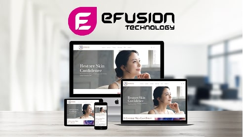
Websites and pages created with responsive web design are designed to automatically adapt to all devices and screen sizes, whether they are on desktops, laptops, tablets, smartphones, or other devices. It combines flexible grids and layouts, images and CSS media queries. As a user switches from one device to another such as a desktop to a smartphone, responsive web design ensures that the site automatically adjusts to the resolution, image size, and scripting capabilities of the selected device. This means that the technology should respond to the user’s preferences, eradicating the need for new website designs and developments every time a new device is introduced to the market.
How does Responsive Web Design Work?
Responsive web design leverages CSS, which serve different style properties based on different elements such as device sizes, orientations, resolutions, and colour capabilities. This then begs the question – how do you know if your website is responsive? This can be done through your web browser. Once you are on your desktop site, press ‘control, shift I’ to launch Chrome DevTools. Next, press ‘control, shift, M’ to toggle the device toolbar. You can then view your page from a mobile, tablet or desktop perspective to see how good it looks. Alternatively, free tools including Google’s Mobile-Friendly Test enables you to determine if your website is mobile-friendly.
Responsive Web Design Benefits
There are other web designs that facilitate mobile-friendliness, like adaptive design, however, responsive web design is still one of the more popular, go-to solutions because of all the benefits it can offer.
1. Excellent User Experience
Perhaps one of the main benefits of responsive web design lies in its ability to deliver amazing user experience. A customer’s first impression of a brand can go a long way in building trust and loyalty, especially if the initial interaction was a positive one. Most of this first contact occurs through a brand’s website. First-time visitors to a web page from a mobile device want to easily navigate a responsive site. If your website is usable, visitors will come back again and again, if not, your bounce rate may increase, leading to potential customer loss.
2. Greater Mobile Traffic

Nowadays, constant access to the Internet has become more of a necessity rather than a luxury. People are surfing the Internet on their smartphones every chance they get. In fact, a whopping 90% of the global population uses a mobile device to go online! With responsive web design, your website is well optimised for mobile, which means you are satisfying a majority of the population. This can result in a boost in mobile traffic to your site.
3. Enhanced SEO Performance
In the world of digital marketing, SEO is an indispensable tool to drive traffic to your website. Responsive web design enhances SEO in a few ways. Firstly, due to them having only one URL, it empowers efficiency for Google to index the site and makes it easier for users to share content. Secondly, a single responsive website eliminates the need for multiple versions across different devices. Thus, duplicate content concerns are eliminated. Ultimately, these can help your website rank higher on search engine result pages.
No doubt, responsive web design is a requisite for businesses to thrive in our highly digitalised landscape. It responds to customers’ needs with regards to using the Internet and positions your brand in a professional and progressive light.
Need support with your web design? We’re happy to help! With an experienced team of website designers and developers, having your very own responsive web design has never been easier! Contact us today for more information.