Though digitalisation has always been prominent, the effects of the COVID-19 pandemic has rendered an increase in prevalence now more than ever. As social distancing and work from home measures become the norm, our reliance on digital tools to help us connect and collaborate remotely has skyrocketed. This also means that websites are now core platforms when it comes to information sourcing or even purchasing of products, organisations must now be aware of new website trends to remain relevant and provide the best service to their customers. In this article, we introduce the latest web design trends every business should know, read on to find out more.
Parallax Scrolling
Year after year, web-based animation trends have grown increasingly popular, from micro interactions to particle backgrounds. Today, parallax scrolling is all the rage. In computer graphics, parallax scrolling is a technique in which background images move faster than foreground images, giving the appearance of depth in a 2-dimensional scene of distance. This creates an added sense of immersion for users. Parallax scrolling increases the user’s page visit time by encouraging them to scroll through the whole design, including the highlighted call to action. It also showcases your organisation’s creativity, innovativeness and professionalism.
Comfortable Colours
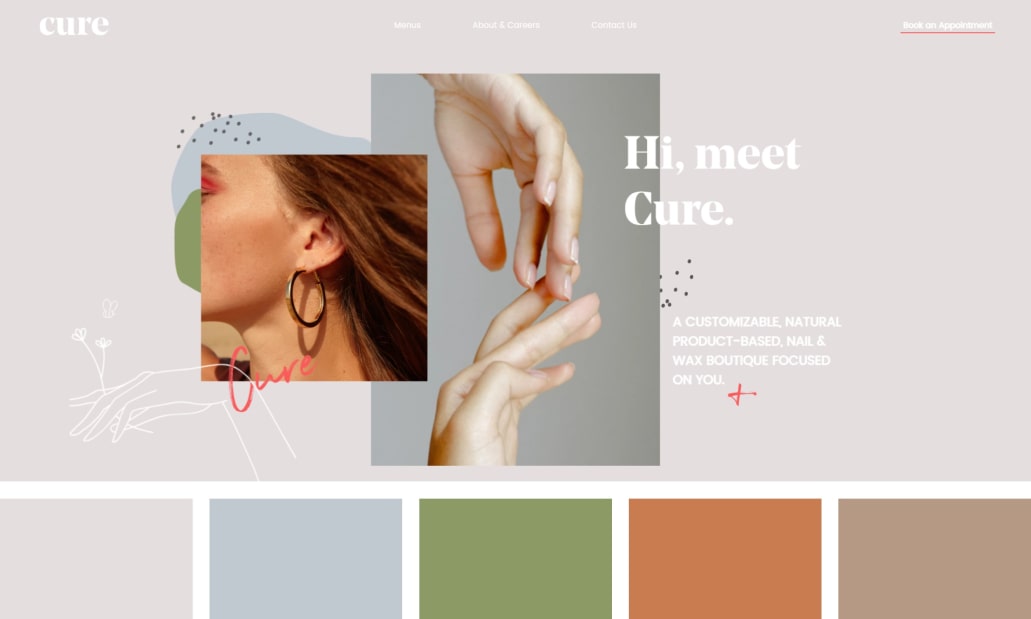
Source: curenails.co
Humans are highly visual creatures. Visual information is processed at an incredible speed by our brains – 60,000 times faster than text. Similarly, colour has a profound impact on our memory.
In a study where participants were presented with colour images instead of black-and-white images, scientists have observed a significant improvement in memory recognition. It is undeniable that colours play an important role in website design and how users perceive your website. Nowadays, many spend most of their time on computers due to the digital nature of job markets. As a result, users are likely to experience eye strains. Colour schemes designed to be easier on the eyes must be taken into account.
Consider softer colour palettes such as wholesome greens, pastel blues, warm browns or light pinks. Besides reducing jarring contrasts on websites, these colours promote relaxation and calmness. While comfortable colours are important to web design, remember to take note of your brand image as well. Afterall, your website is the main platform that accentuates your brand identity. Try to complement your brand colours with neutrals where possible.
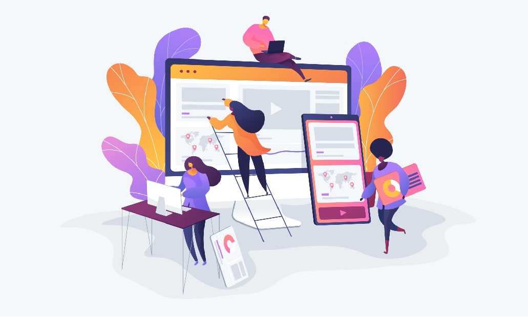
Multimedia Content
Beyond aesthetics, website design is also about the user experience (UX). One way to enhance UX lies in multimedia content. Multimedia content is the use of multiple media such as videos, text infographics and images in one place. A strong multimedia strategy helps to effectively and efficiently reach your target audience. It is the perfect way to synergise a text-heavy content mix, allowing you to communicate your message visually, enliven your brand, create dynamism, and increase social sharing and traffic. Furthermore, multimedia content can also help to attract more links to your site, which is helpful for building your online presence.
Mobile Optimisation
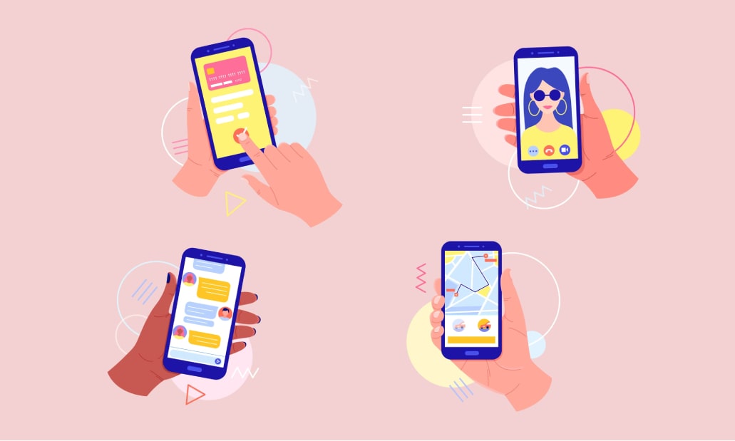
Today, the use of smartphones has reigned dominance in almost all parts of the world. This is no surprise considering the convenience and accessibility it brings. As smartphones become an integral part of our lives, websites with a mobile-first design is a must-have. Being mobile-first shapes your business with mobile users as the priority. This undoubtedly includes your web design and how well it works for mobile. The benefits of a mobile friendly website design are in abundance.
Firstly, you are appealing to a large majority of the population as people are using their phones even more than their desktops. Secondly, mobile-first designs tend to be less buggy. Compared to desktop sites that use complex codes for more styling options, mobile websites are simple even in their coding. When users land on a website that has faster load times and provides a seamless experience, they are likely to stay on that site longer, thus, reducing bounce rates.
Ultimately, these are just some of the current popular trends in web design. When it comes to website design, it is important to consider both form and function. One should not precede or prioritise the other. In this way, the best UX can be delivered to elevate your overall brand identity and drive conversions.
eFusion Technology is a website design company in Singapore helmed by an experienced team of designers and programmers. Be it website design, development or even mobile sites, we are here to help you accelerate efficiency and growth on your page. Contact us today for more information!